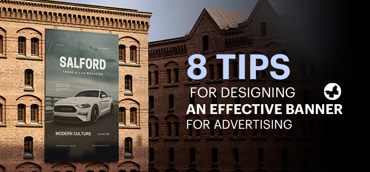
Print banners remain a vital marketing tool that can powerfully communicate your brand’s message visually to a wide audience, influence purchase decisions, and stir interest among potential customers. Learning how to design a banner skillfully can bring sizeable returns to your marketing efforts. This article will guide you in your journey to designing a high-impact print banner.
Contents
The Importance of Banner Design
A banner is more than just an attempt to catch the eye–it is a potent tool to deliver your brand message and elicit specific actions from potential customers. Hence, each design decision, from the choice of colour and fonts to the positioning of the logo and use of images, should be purposeful and aligned towards achieving these goals. Effective banners create a connection between the brand and its audience, set the right expectations, and ultimately drive business outcomes. In the following article, we will look at how to make a banner effectively and create a banner that demands attention.
Read More: Graphic Design Trends for 2024
Know Your Audience
As a cardinal rule, identifying your target audience forms the foundation of effective advertisement and design. A well-defined understanding of who your banner is designed for allows you to customize visuals, language style, and overarching message appropriately. A thorough grasp of your audience’s preferences and habits ensures the creation of a design that captivates their attention. It’s not just about creating a banner that accurately represents your brand – it’s about ensuring the banner design ideas resonate harmoniously with your audience’s requirements and expectations.
Embrace Simplicity
In designing print banners, less is frequently more. Given the fleeting nature of a passerby’s attention, imparting your message powerfully in a split second is paramount. Overstuffing your banner with text or cluttering it with complex visuals can dilute its core message. Instead, a minimalist design with a spotlight on key points enhances your banner’s communication efficacy.
Clear Messaging is Key
Your written content should be succinct and impactful. A glance at your banner should convey its intent swiftly to the viewer. Stay clear from jargon or industry-specific language, favouring everyday language instead. Apart from garnering attention, your banner should trigger specific actions— a vivid call to action, conciseness, and directness in your messaging can do precisely that.
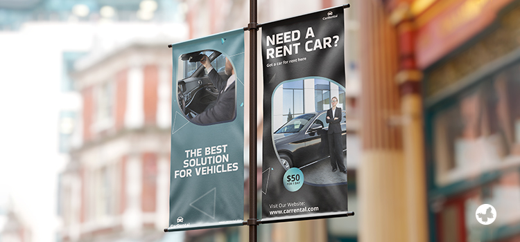
Use High-Quality Images
Images form a vital part of your print banner, serving to communicate ideas swiftly while enhancing visual appeal. However, the quality of these graphics is key. Grainy or blurry images can detract from your banner’s professional aesthetic, and deter potential customers instead of attracting them. Pay close attention to selecting high-resolution images that reflect quality while effectively captivating your target demographic. For large-format banners, the acceptable resolution is 300 dpi or higher.
Incorporate Your Logo
Your company logo should have a prominent place in your print banner design, aiding brand recognition. While the traditional upper-left placement aligns with habitual reading patterns, this isn’t hard-and-fast. Experiment with your logo placement whilst ensuring it doesn’t overshadow your primary message.
Consider Colour and Contrast

Colours play a pivotal role in the effectiveness of your print banner. Devote time to select colours that align with your brand’s identity, fostering visual consistency throughout your marketing channels. High contrast, simultaneously, heightens readability and infuses dynamism within your banner design.
Choose the Right Fonts
Fonts significantly influence your banner’s readability after printing. Fancy or intricate typefaces can hinder quick reading comprehension. Strive for text legibility and refrain from mixing too many font styles, which might lead to visual disarray. A balanced choice of uniform, clear fonts ensures your message is conveyed as intended.
Test Before Final Print

Testing is a vital phase in print banner design. Assess its visibility and readability from varying vantage points and distances, emulating the unpredictable perspectives from which it may be viewed in reality. To further gauge its effectiveness, print a reduced-scale replica or examine it on a digital screen to scrutinize the interplay of colours, images, and text. This analysis will offer a tangible snapshot of the outcome, enabling you to fine-tune and perfect your design before it reaches its viewers. Leverage testing as a vital step to ensure your banner’s success and lasting impact.
Conclusion
A well-crafted print banner, apart from grabbing instant attention, communicates your brand message effectively and triggers the desired response. Understanding your audience, keeping the design minimalist, utilizing high-quality images and legible fonts, and incorporating your logo are the core components that contribute to the success of your print banner.
Remember, even the most attractive banner will fall short if it doesn’t resonate with your audience or convey your brand’s messaging accurately. So, while creativity is vital, ensure it aligns with your brand identity and the expectations of your target audience.
We hope you find this content from ButterflyGP useful. Please share your views with us.