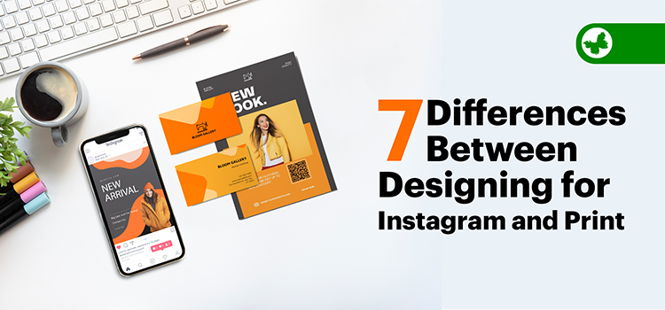
Instagram is a busy, colourful place where designers can show off their work to people all over the world. On the other hand, printed items like posters, books, and leaflets have always been popular ways for designers to express their ideas.
This article by ButterflyGP will explain the seven main differences between designing pictures for Instagram and creating print designs. By the end of it, you’ll understand what to pay attention to when designing for these two different outlets to make your work stand out and engage your audience.
Read More: How to Prepare Your Design for Printing
Contents
Designing for Instagram vs Real-World Design
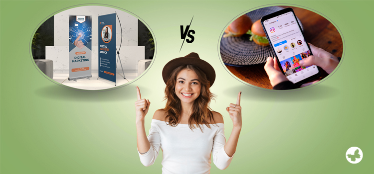
Before we explore the distinct features of designing for Instagram and print, it’s important to understand the big picture. In simpler terms, we’re talking about understanding the rules of the game. Each platform, Instagram and print, has its own set of rules when it comes to design.
As a wholesale trade printer with decades of experience, We at ButterflyGP have felt these differences firsthand. With that in mind, let us dive into seven key differences you need to know when designing for Instagram vs. the print industry.
Choosing Design Styles for Instagram and Print
Designing for Instagram and print means using different strategies to make things look good. When creating designs for print, like on big billboards, posters, or small business cards, there’s usually more room for adding details.
But Instagram, which we mostly use on our phones, doesn’t give us a lot of space. This means designs for Instagram need to be simple and straight to the point so people can understand them quickly when scrolling through their feeds. This can be quite a challenge because it’s about getting your message across on a smaller screen.
Creating a Visual Identity
When you’re designing for Instagram, you want everything to look tied together. This means using the same colours, pictures that look similar, or specific fonts in every post to make them easily recognizable. This is like giving your Instagram its unique style.
Now when it comes to print, the focus is more on making each project stand out. There isn’t always a need to keep a similar style throughout unless you’re designing specifically for one business or brand. This way, every piece of design can be different from the others to suit various needs.
Colour Modes: RGB vs CMYK
Designing for Instagram and print also differs in the types of colours used. For Instagram posts, we use RGB colours made up of Red, Green, and Blue, because they work best for digital screens like laptops or phones.
On the other hand, when it comes to print design, like for posters, we need to use CMYK colours. These include Cyan, Magenta, Yellow, and Black, and are specifically made to look good when they are printed out on paper. This is a crucial difference to note if you want your designs to look their best.
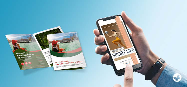
Image Size & Quality
When it comes to Instagram, we need clear and sharp images that look good on our phone screens. Instagram suggests using images that are 1080 pixels by 1080 pixels for posts that are square and the usual resolution is 72 dpi.
But with print design, like for posters, we need images with much higher quality (usually around 300 dpi). This means the pictures are of much higher resolution and quality, which helps keep all the details crisp and clear when the design is printed on paper.
Text Usages
In Instagram pictures, we should only use a few words because people usually scroll down quickly and don’t spend a lot of time looking at posts. When designing printed materials, like booklets or papers, we can add more words because these are made to share more detailed information.
Making sure that people can read the words easily is important for both Instagram and print designs. However, when creating printed designs, there’s more room for using different sizes and styles of writing for various reasons.
Storytelling and Engaging Your Audience
On Instagram, we can use features like Stories and Highlights to share casual posts or group-related posts, making it fun and interactive for the audience. However, you can’t do this with print designs.
Unlike Instagram, each print design is on its own and needs to grab attention by itself. This difference is important to remember when you’re planning what kind of design to create and for which platform.
Consideration of the Bigger Picture
On Instagram, it’s not just about how good each picture looks but also how all your posts look together on your profile page. This creates an overall beautiful and well-thought-out look. But for print designs, it’s usually about making each piece—like a poster or a page in a booklet—look good on its own.
Sometimes, print designs might be connected, like in a brochure or booklet, where the designs on different pages need to match or relate to each other. Reminding ourselves of this difference can help us make better designs for each platform.
Handy Tips for Instagram and Print Design
A few crucial concepts to keep in mind when designing for both platforms:
- Keep it simple: Overly complex designs can confuse viewers in both the digital and physical worlds.
- Consistency: (especially for Instagram) helps shape your unique style and stand out.
- Use of Call-to-Actions (CTAs): This is a common practice in Instagram to engage followers but can also be employed effectively in print marketing to inspire action.
- Image size and quality: Always use high-quality images with correct dimensions for Instagram and high resolution for print materials.
- Captions and storytelling: While print design facilitates a comprehensive narrative, use captions productively in your Instagram post to add a layer of context or intrigue.
Conclusion
Designing for Instagram and the print industry each have their unique set of considerations. What works for Instagram might not translate well into print design, and vice versa. Understanding the differences between these mediums will allow designers to create captivating and effective content for both. Continue to learn, adapt and experiment, and you’ll be well on your way to mastering design in both the digital and physical world.