When it comes to establishing a brand’s identity, choosing the right colours for your brand is crucial. In this article, we’ll delve into the basics of how to choose brand colours, the significance of a brand colour palette, and the deeper implications of brand colour meaning.
Contents
Brand Colours: More than Just Aesthetics
Before choosing your brand colours, understand that they’re much more than just visual appeals. They contribute to how customers perceive your brand, determining whether they feel trust, excitement, or comfort when they encounter your brand’s visuals.
Determining your Brand’s Identity
The first thing you need to know when learning how to choose brand colours is to understand your brand’s identity. What is your brand’s personality? Is it formal or fun, conservative or revolutionary, elegant or everyday?
Consider how you want to be perceived. For instance, a youthful, innovative tech company may choose bold, vibrant colours to stand out in the traditional market, while a luxury fashion brand may opt for black, gold, or other colours associated with elegance and sophistication.
Industry Expectations
Another crucial consideration is your industry’s expectations. For instance, many finance or medical companies use blue in their logos because it’s often associated with trust and stability. On the other hand, food and beverage brands usually opt for warm brand colours like red, orange, and yellow because these colours stimulate appetite.
What Do Brand Colours Mean?

Understanding colour psychology is crucial when choosing your brand’s colours. Let’s delve into the primary brand colour meanings of various colours:
- Red: Excitement, passion, vitality. Brands that want to evoke these feelings often utilize this powerful and attention-grabbing colour.
- Blue: Stability, trust, calm. Brands that want to instill a sense of trust and calm in their audience typically use varying shades of blue.
- Green: Health, tranquillity, power. Green is perfect for wellness and outdoor brands that want to project a sense of peace and natural wellness.
- Yellow: Happiness, optimism, creativity. Ideal for brands wanting to demonstrate a sense of positivity and a sunshine-like experience.
- Black: Luxury, elegance, mystery. Brands in premium or luxury industries use black to evoke a sense of sophistication and exclusiveness.
- Purple: Spirituality, luxury, inspiration. Often associated with creativity and lavishness, it’s used by brands who want their customers to feel inspired or pampered.
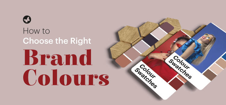
The Brand Colour Palette: A Cohesive Story
It’s not just choosing a single colour or two. Brands often have a branding colour palette – a collection of primary and secondary colours. The primary colours do the heavy lifting, often being predominant in logo design, while the secondary colours complement, bringing depth and flexibility to visual identity. This palette helps in creating a harmonious and cohesive visual experience.
Testing & Feedback

Once armed with potential brand colours, solicit feedback. You can use online surveys, social media polls, or in-person meetings to see how your audience reacts to different colours and combinations. Use this information to adjust and fine-tune your brand colour palette, making sure it resonates well with your target market.
Read More: The Benefits of Social Media
Implementing Your Brand Colours
After choosing your brand colours and having a brand colour palette, start implementing them across all facets of your brand. They should be seen on your packaging, website, social media profiles, print materials and even your office aesthetics! The goal is to create a consistent and visually pleasing experience that stands out.
Be Consistent
Consistency is key in brand recognition. Use the same set of colours across all representations of your brand. This isn’t about monotony but rather about fostering a sense of familiarity and continuity. The aim is to ensure that within a few encounters, customers can identify your brand by merely seeing your brand colours.
Be Adaptable
That said, while maintaining consistency, it’s also important to be flexible. There might be a need for seasonal changes or a complete brand overhaul in the future. An adaptable approach to colours allows your brand to thrive & evolve with changing markets.
Conclusion
Understanding how to pick brand colours isn’t just about personal preferences but involves understanding your brand’s personality, industry norms, and colour psychology. A well-thought-out brand colour palette is not merely an aesthetic choice but a tool that subtly yet effectively communicates the ideals and emotions behind your brand. With consistency and adaptability, even something as simple as a colour can carve out an identifiable space for your brand in consumers’ minds. So, choose wisely!
We hope you find this content from ButterflyGP useful. Please share your views with us.